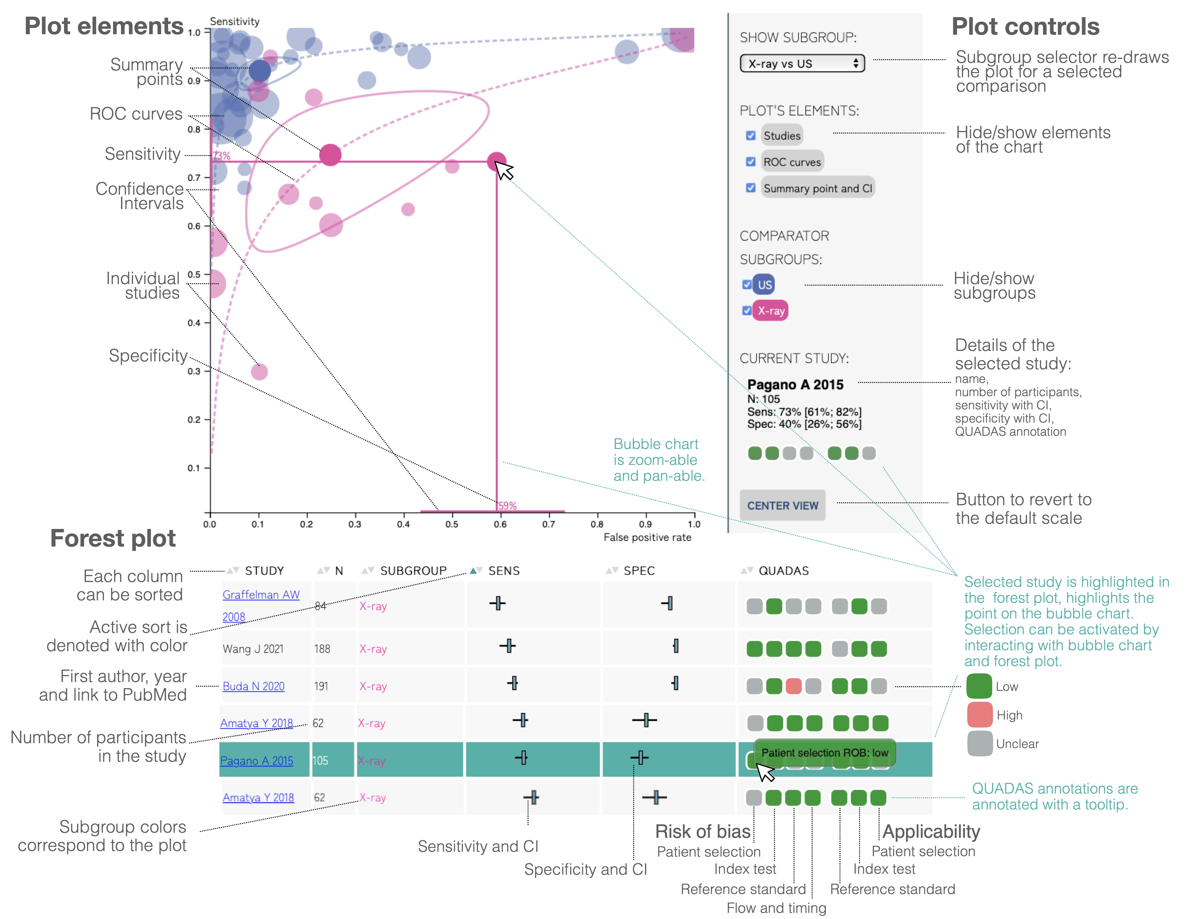
Elements of the Diagnostic Test Accuracy meta-analysis plot. The visualisation consists of a bubble chart, plot controls, and forest plots. The bubble chart shows individual studies, summary points with confidence intervals, and the ROC curves (receiver operating characteristic curve), each of those elements can be turned off and on by the controls in the control panel. The studies, ROC curves and summary points are shown for each of the subgroups separately and also can be turned off and on by the controls on the right side.
The plot is interactive. You can hover and click on one of the bubbles to highlight the corresponding row in the forest plot, show the annotations and confidence intervals, and update the control panel description. Conversely, clicking on the row in the forest plot will highlight the corresponding bubbles.
The canvas of the plot is zoomable and pan-able. The size of the bubbles does not change while zooming, so it is possible to analyze them in detail when the bubbles overlap in the general view.
The Forest plot includes the First author and the year of the study. If available, is also a link to the pubmed page, the number of participants, sensitivity and specificity indicators, and the indicators of the confidence intervals. The last column corresponds to the QUADAS plot. The first four boxes correspond to the Risk Of Bias (ROB) terms, and the next three boxes, to the Applicability. The QUADAS box is equipped with a tooltip.
